

I am appalled at some trends in the User Interface design these days. Touch screen devices became an entrenched market a couple years ago, and suddenly everyone and their mother decided to optimise the User Experience (UX) to take into account this new animal. Nothing bad about the general idea, but unfortunately in some cases the results seem to have been the apparent devolution of the UI design.
Less chrome is not always better
First, everyone suddenly started talking about “reducing chrome”. For an uninitiated, the chrome in question is not Google’s Internet browser, but the part of the UI that is not relevant to the main functionality of the application – menus, buttons, and all the space around it. Interestingly, optimising for touch interface means that the controls have to actually be larger to accommodate the size of user’s fingers. Therefore these two goals – reducing chrome and optimizing for touch – are to a certain extent mutually exclusive.
The result of this two incompatible demands was the move from a 3D-like interface with buttons, lists, text fields and other controls sticking out of the screen towards a flat surface covered with supposedly simplified icons and simple shapes or even plain text to mark text fields or drop down menus with very little demarcation. To a certain extent this is understandable, and such a design indeed reduces the unnecessary clutter. It works splendidly for simple mobile applications with very limited real estate and therefore limited set of menus and controls which can be displayed on screen at once. However, in many cases of desktop apps with more complex set of options, this minimalism turns the obvious into ambiguous, violating the very first basic rule of UI design, the Structure Principle, which says that “design should organize the user interface purposefully, in meaningful and useful ways based on clear, consistent models that are apparent and recognisable to users, putting related things together and separating unrelated things, differentiating dissimilar things and making similar things resemble one another.” (emphasis mine).
When active elements of the screen start looking like passive – for example, when you cannot differentiate at first glance between an editable text field and a static text, or a button, unless you click or hover over them, you move from recognition to exploration – sometimes even risky exploration. And while exploratory interface might be fun in certain applications which goal is to invite you to interact with them, in most cases it is a big no-no. It kills productivity, forcing a user to use his recall skills instead of recognition. If I can remember that in this dialog that text is an editable field, I’m good. If I can’t, I have to check it each time I open this particular dialog. Of course, after a while I will learn the quirks of an application, but this forces me to use my working memory which should be occupied with the task that I’m actually doing at the moment, not with trying to figure out the user interface.
Ugliness creep
Another victim of the new wave of design were the icons. Designing icons is often hard, especially if you have dozens of them to take care of – I know it from experience. It’s one of the parts of the UI design which I dislike. However, I can appreciate the good design, and admire talented folks and their creation. Unfortunately, with the “reduction of chrome” inevitably came the more crude, simplistic, and sometimes even stylised icons. Where once we had attempts at mimicking the real world – sometimes even carried to the extreme with more or less successful skeumorphism (imitation of the real world interface) – now we are facing an onslaught of thick-lined unreadable, overly simplified monstrosities which sometimes only the designer can guess the meaning of. Here the blame most likely lies in an attempt to accommodate various resolutions, and using SVG vector format. Yes, it’s easier; yes, it’s faster, and yes, the design budgets are not what they used to be. But now everything looks like it has the detail of 16×16 pixels icon from Windows 3.1. And on top of that most of the time only using a single colour. Because vector colour art is… you know… difficult?
Missing colours
At some point this minimalism also extended to colour overall. I think we can partially blame attempts at accessibility – quite a few people are partially or totally colour-blind, and for them the colour in the UI might indeed be more of a hindrance, than help. However, to voluntarily resign from all colour or to limit your application to white, black and one other colour (in most cases blue), is throwing a baby out with the bathwater.
Colour in the UI can perform a few very important roles – organisation, legibility and communication. I strongly suggest you to give this 1995 article by Suzanne Martin a look, especially the final section about colour. She succinctly points out its possible uses and best practices. Let me illustrate it with a few examples.
I think the most complex applications ever are the ones dealing with 3D graphics. The number of options, scene elements (primitives, effectors, particle emitters, cameras, lights, environment objects, rigs, etc.) is humongous. I admire folks who can create a usable interface for these monsters, because it is truly a Herculean challenge and requires a designer with great skill in many areas.
The most successful UIs for 3D – apart from being painfully consistent and well thought out – cleverly use colour to differentiate various elements, so that the user can immediately discern which part of the 3D application the piece he or she is looking at belongs to. Take a look at Modo, Cinema 4D, or even the latest Maya release and compare it to 3D Studio Max. It’s no wonder that people have easier time learning the first two. Learning the last one is really an exercise of repeat, memorise and recall, because the UI makes little sense and is extremely inconsistent.

Cinema 4D interface makes use of a few colours and goes to great lengths to be consistent and readable.

3D Studio Max uses colour in limited fashion to bring some elements together, but in general it is one big mess of icons with different sizes and poor design.
September 2014 release of Adobe Creative Cloud, and especially After Effects 2014.1, did see a strong movement towards the minimalism and monochromaticity. It was very, very painful. You could not distinguish any longer what type of media was in your project or in your composition, because the icons were extremely small, and they all were grey and transparent. Gone were the colours. The text fields and buttons started looking the same, and checkboxes were unassuming little squares. With the move towards a darker default UI brightness some controls were really difficult to distinguish. Even though a lot of chrome was gone, it did not help the readability at all. Quite the opposite.

Text fields, drop-down menus and buttons look almost the same in the new After Effects UI (on the left). While the old scheme could certainly be improved, it was much more readable.
The main culprit behind this blog post is, however, Libre Office, which in version 4.3 had remotely interesting, moderately detailed and workable icons in the UI, and moved to their ugly, fat, monochromatic counterparts in version 4.4. I really cannot comprehend what prompted the community towards this new direction, but it is awful and the design hurts my eyes each time I have to look at it. Some icons are almost indistinguishable (for example add row and delete row in LibreCalc), precisely because of the lack of colour, and to an extent by their lack of detail and heavy stylisation, making them almost unreadable. Can you point the icon which will export your spreadsheet to the PDF? I couldn’t. I wouldn’t ever know, had I not read the tooltip on something that looks like a reversed number 7 on a page. Come on! Why not use the standard PDF file icon?
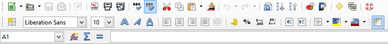
The icons in the old Libre Office were perhaps not the most awesome, but they were clearly grouped and pretty distinctive.

In the new Libre Office interface everything looks the same, and some icons are hard to distinguish. Did I also mention they are crude and ugly?
Speaking of PDF, Acrobat is as guilty of stylised, monochromatic icons in the main toolbar. My eyes are no longer drawn to the navigation arrows, and I have to actively seek them out. Designers tried to compensate for it by assigning colours to various tools in the side panel, which is kind of nice, but here they also missed the boat – can you tell a difference in colour between “Enhance Scans” and “Protect”? Or “Fill & Sign” and “Send for Signature”? I couldn’t. The basic advice to use about 5 colours, perhaps up to 7, is broken here. The reason this magic number (5±2) appears again is mostly the size of working memory. Of course, discernibility is another factor, but perhaps less important. Working memory size is really the reason for a lot of things we do in UI design. In this case it would make much more sense to place these tools in 3-5 groups, each with its own distinct colour, and differentiate within a group with a clear icon. Of course, all tools within a group should be placed together – perhaps sorted alphabetically? – and perhaps some kind of separator should be added as well. Then this jumble of words and pictures would make much more sense.
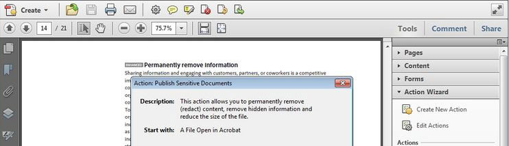
Acrobat X – perhaps not the best designed icons, but at least distinguishable from one another, and a hierarchy is pretty clear within the tools menu and the darkened left dock menu.

In new Acrobat DC everything looks the same. It’s slicker, and less obtuse, but not as efficient and much less clear about the hierarchy.
Interestingly, I am absolutely not bothered by the monochrome interface of Photoshop, Illustrator and InDesign. However, if you take a closer look at them, they still do have quite a lot of “chrome” in them – dropdown menus, text fields, buttons, checkboxes still have borders, the icons are relatively few, well designed, well placed and well grouped, and in most cases easy to discern. This serves as a good anti-thesis to my general remark about colour, but it’s also a great testament to the 30 or so years of UI design, that the minimalistic trend seems to want to set aside.
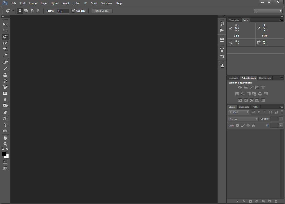
Photoshop – monochromatic interface with a lot of detailed, readable icons. Or perhaps I am simply too familiar with this application to bother criticising it’s UI.
I am also not that opposed to the flat, monochromatic UI of Evernote, which I use to write these words, even if I don’t know what half of the icons mean. They do not bother me that much, and it is quite a successful attempt at UI minimalism. But then, it does not have a lot of controls, the icons are mostly high-res, legible and few in number.

Evernote minimalistic, but detailed interface. It just sits and does not disturb your work.
And you know what? Final Cut Pro X UI has tons of chrome, is pretty colourful and for some reason people love it.

Final Cut Pro X – quite a lot of chrome in some places and some colour. I have mixed feelings about it, but a lot of people love it.
Conclusion
Let’s leave this minimalistic nonsense where it belongs – in the minimalistic applications on the minimalistic screens. Let us not be afraid of making the most of what we have, and give the users the experience that they truly deserve. Bring back some well-thought out diversity to the UI design please.


Amen to that.
I can’t actually use Premier CC anymore. My eyes just see a random constellation of text. Its not an interface.
Brilliant article, there are no ‘user interface’ designers any more – we aren’t seeing new interface elements, because virtually nobody on the planet is capable of THINKING, hence all we have is this race to the bottom with ‘flat’ and ‘less chrome’ bullshit. So many applications are almost unusable nowadays due to this insane insistence on removing buttons – that’s the main problem we are all facing. And grey text that is almost impossible to see. Many websites are now going to extremes with how light they can make their text – like the word ‘Reply’ in this comment section, and the borders of the comment boxes – laughable. Designed by idiots who claim to be ‘designers’, but who can’t actually design anything at all, they just COPY everybody else – and everybody else is doing it wrong.
you are so right.