

Contrast is simple, right? A juxtaposition of two or more elements having markedly different features makes them stand out. What can be complicated about that? Turns out, as with all things, the comprehensive answer is much more complicated, and the devil is in the details.
Coming from extensive Photoshop and photo retouch background, I thought that I understood the luminance contrast pretty well – until I read this thread on the Lift Gamma Gain forum. James Hall brought up an interesting point about the fact that most contrast controls in various software packages do seem to increase perceived saturation when the contrast is added. And he is perfectly correct. For years I have been taught to dial down the saturation to compensate for this effect. And it gave me decent, though not perfect, results. I was also taught to use the Luma curve to disregard the color channels or do the trip to the Lab color space, and apply the correction to the Lightness channel. These two methods are roughly equivalent of one another.
However, James did not settle for this. He pursued the subject further, and came up with the result that surprised even myself. He got the best results by adding or reducing contrast to the lightness channel in the HSL (hue-saturation-lightness) color space. This reduces the perceived increases or decreases in saturation, because the HSL model of saturation depends on the lightness of the given pixel. Which in turn creates pleasing effect when a contrast curve is applied to the lightness channel.
Even though there is a lot of flack directed at the HSL color space from the professionals – Charles Poynton goes as far as advising it to be abandoned in his Color FAQ – most of it concerns the hue component, which is not in any way referenced in this operation. Mindful of this criticism though, James modified the conversion back to RGB to scale the saturation to match the change in lightness. Personally I found the results very interesting.
We got in touch, and decided to create a plugin for Premiere and After Effects, that would put the results of his research into your hands.
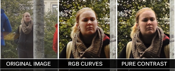
Let me then introduce the Pure Contrast plugin, which not only works in the HSL color space, applying contrast to the Lightness channel, but also applies a real S-curve instead of simply multiplying the values around the pivot point. Additionally, you can tweak the shape of the curve to your heart’s content using a plethora of parameters, which give you total control over its handles, keeping your white and black points intact – unless you move them yourself, that is.
The detailed description of how the plugin works is available on the Pure Contrast instructions page, and for your convenience we recorded two tutorials that give you the technical overview, and the benefits of working in the HSL color space. We hope that you will find this solution useful.
Finally, I am proud to introduce James as a member of the Creative Impatience team. This is the first time that such a collaboration took place, and I’m looking forward to more similar initiatives in the future.


Hi Bart,
That was an interesting read/watch. Is there any way to replicate your technique within Resolve?
Regards
Pepo
Thanks, Pepo. I don’t think there is a direct way to precisely replicate what we do, because the HSL processing is altered in our plugin. But you can switch the node to the HSL color space, and apply the S-curve to the blue channel (Lightnesss) only. It will have a similar effect.
Thanks Bart, I will have a go with that!
You guys have the best plugins. This is an exciting addition and I’m excited to test it out. Thank you for sharing your knowledge and skills with everyone. Definitely donating to the cause.