I was hoping to bring you something more than my ramblings about the user interface overhaul in the latest Adobe release, but unfortunately it looks like the interview with the User Experience (UX) team will not be forthcoming, despite initial positive reactions. My impatience has caught up with me, and therefore I present you with the reasons for my vocal criticism of the new UI.
It started with the blue…
I first saw the new incarnation of the UI for Adobe DVA applications in Media Encoder, and I was immediatelly put off by the change from the warm, mellow yellowy orange into the aggressive fluorescent blue. I had a very visceral reaction to it, which surprised me to the extreme, as I tend to be pretty interface agnostic.
It was a very strange feeling – I was both attracted and repulsed from the color. My eyes were darting all over the place, and I was unable to focus my attention on anything in particular. The blue was everywhere, and I could not run away from it. For the first time in my life I felt I was being assaulted by a color! A slight headache that I developed after looking at it for a longer period of time did not help to alleviate the initial impression.
The dark, flat interface made me feel like I was diving very deep underwater, where fluorescence is the only way to visually communicate both attraction and danger, because no visible light reaches to such depths. It’s a strange world, almost another planet, the one that you have to explore with caution, because every step can be your last.
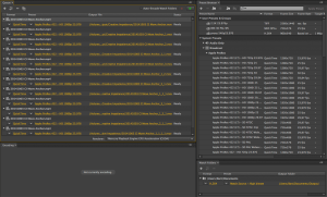
Interestingly, a few days after I realized where the blue came from, when I was listening to a podcast on my phone. Yes, the blue on black theme is ever present on mobile devices, and it seems to work there mostly fine. But there is a difference between a 3-inch screen, and a 24-inch one. What’s good for mobile is not necessary good for desktop, especially in abundance. Compare the above screenshots to the gentler colour scheme in CC:
The wax-ear yellow, as I heard it described, is mellow, sits patiently in the background and waits for your interaction. The fluo-blue is obtuse, aggresive and gets in your face – or at least it got into mine. It’s almost shouting “interact with me now!”, and I have to actively ignore it. I wouldn’t mind it if some of it was present in the most important places. But at the moment it is overpowering and overwhelming.
…then I got lost.
Consistency if the main principle of good UI design. At first sight you could think that the fluo-blue simply tells you that you can manipulate this element. And to a certain extent it is the case, but not always. For some controls the fluo-blue means also that they are turned on – like these switches underneath the timecode display in the timeline panel in Premiere:
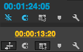
Switch Icons and the timecode in Premiere Pro Timeline look now like they belong to the same category of items and have the same importance, but the gray buttons do not feel like switches at first sight.
Notice how the inactive switches are gray, breaking with the “I’m blue, interact with me” theme. There are many more instances like this. Also, the blue, because of its aggressiveness, tends to clump together the unrelated controls from around the whole screen, a much wider area than the mellow yellow did. And the timecode is not really related to the snap, link or visibility switches, so why should it look the same?
All cats are grey in the dark
Which brings me to the third main point – everything looks like everything else. The discernibility and readability decreased a lot with the now flat interface. Let me give you a few examples:
The sequence and media icons in the thumbnail view in Premiere now (the row above) are very hard to discern at first sight. Right now there are only two colors in the interface: fluo-blue and light gray.
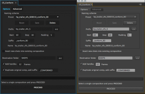
Text fields, drop-down menus and buttons look almost the same. The controls also have the same color as the empty space next in the interface.

The modified regions and clip effects in SpeedGrade are now signified by semibold font and can hardly be discerned any more.
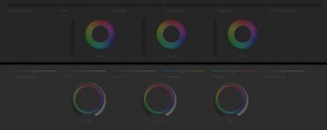
SpeedGrade look controls were hard to discern in the beginning, but now they are even worse with the removal of tint and temperature colors in the sliders.
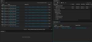
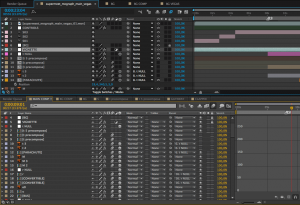
And finally, with the default brightness setting it is very hard to discern both the text fields (search boxes in this case) and the check boxes. For the first time in the history I had to raise the default brightness of the interface instead of lowering it to actually be able to see the controls. Yes, I know they are there, because I am a seasoned user. But it also frustrates me to no end that if I open a new script in After Effects, I no longer can discern at the first sight what the controls are.
I have a few other minor gripes, like the ugliness of Premiere playhead or the new sliders and the new position of the panel menu that you now have to hunt for, instead of looking in the upper right corner of the panel, but I don’t want to undermine the argument by focusing on minor details. These three major issues – the aggressiveness of the fluo-blue, the lack of consistency and the monochromacity – are the real killers here, and they should be addressed one way or another.
At some point the race to simplify starts to work against itself. Perhaps the old UI was indeed too clunky, as you can see in the screenshots above. But the new one goes too far in the opposite direction, and requires you to actively engage with it, explore to discover the meaning behind the controls, to wonder and wander. Which might be fun, when you first look at it (maybe that’s the “wow” factor), but it’s rather counter-productive when you have actually some work to do.
I hoped to have some intelligent discussion on the subject with people responsible for this design, but so far the general attitude has mostly been “everybody who sees the new UI, loves it”, and the open criticism, even the constructive kind, seems not to be welcome, and is in most part ignored. Yes, you can hear from time to time that this interface overhaul is a work in progress, but the overall vision seems to be pretty much set in stone and seems unlikely to change unless there is a loud outcry from the community.




I knew there was something about it that bothered me. You said it just right. I hope they at least tweak it to bring it more to the middle soon.
Making a change for the sake of “making a change” has resulted in a huge step backwards in terms of usability and productivity. As a 15 year Adobe user, it’s extremely disappointing to see their reaction (so far) to fixing this mess.
hey I shared your post here:
https://forums.adobe.com/message/6839765#6839765
please come and contribute to the discussion if you want
Thanks. There’s little more that I can contribute beyond writing this article though. It’s good to see that others are also having similar observations.
I think the problem is that these editing programs are very robust with so many features that things fall through the cracks. Overtime the developers will identify some of them but most of the changes will fall on deaf ears.
Hi Bart and everyone,
You can let the team know how you feel here: http://adobe.com/go/wish
Thanks,
Kevin
I much prefer the contrast of the yellow over the blue for text. The colored track selectors are a welcome change, but overall I find the interface unpleasant to look at. I wish there was an option to change the blue color back to yellow. I think the flat icons look “unfinished” and some are smaller and hard to select.