Two Great Strides in the Democratisation of Colour Grading

Regular readers of this blog know, that I have been dreaming about a low-cost grading control surface for years. At some point I even considered attempting to build one myself, but this project never got more serious than an extensive set of notes. There were a few remotely interesting ideas around, including the Oxygen TecPro panel, the use of Kingston trackball or some midi hacks with various controllers, but these were either makeshift or still too expensive, not suited for the ultimate goal that was to make every editor have it in their suite. Today the announcement of Tangent Ripple and support for it in the upcoming update of Adobe Premiere Pro and Color Finale for FCPX hopefully closes this chapter.
see more

D is for “Deselect Before Applying a Default Transition”

The very first thing that you should do… no, let me try again. The very first thing that you must do after installing and opening the new Premiere Pro CC is to set a keyboard shortcut for Deselect All. Trust me. This will save you a lot of trouble later.

This is something that you must do as well, if you think that applying transitions in Premiere no longer works.

Open the Edit menu, choose Keyboard Shortcuts…, and in the search box type “deselect”. Fortunately only one option will be visible, the one that appears in the Edit group – “Deselect All”. Assign a shortcut to it which will be easy for you to remember. I sincerely recommend D , because D is also used to apply default transitions. And if you have used Premiere before CC, you will have to learn this new shortcut combination:  DCmd /Ctrl + D to apply the default video transition, or  DShift + Cmd /Ctrl +D for audio transitions.


shortcut

Set this shortcut right now!

Why?

Premiere Pro CC introduces what is called “the primacy of selection”. Translated to plain English it means, that if you have anything selected in the timeline, Premiere will attempt to use the selection for any operation you choose, disregarding track selections, playhead position, etc. While there is an argument to be made that it’s more effective, more consistent (well, perhaps some day), it is changing the behavior which was long established in Premiere – using the playhead position for applying transitions.

Here’s how the new behavior works: if a clip is selected, and it is between two other clips, nothing happens. If the clip has at least one edit point where it does not touch anything, then the selected transition is applied to the loose ends. And if multiple clips are selected, the transitions are additionally applied between these clips. Not very obvious, right?

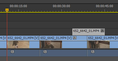
before

The clip on track V2 is selected. You might not even notice it. At least I didn’t!

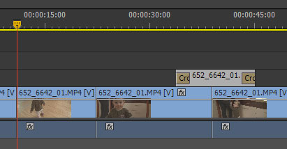
after

And here’s the result – instead of applying the transition to the edit point under the playhead, the selected clip receives the transitions on both sides.

If you are like me, and you select and deselect clips all the time, whether to adjust effects or for any other reason, then this new behavior is going to bite your muscle memory hard. Before you learn the  DCmd /Ctrl +D combination, you will find yourself cursing two times: once when the desired transition does not appear in the place you think it should, and the second time, when during preview you find stray transitions in various places.

This is the collateral damage or “the primacy of selection”. If you forgot to deselect, and want to use the old way of applying transitions – by the track selection and playhead position – then you are screwed, and need to adjust. It does not help to know that this behavior is the result of Final Cut Pro’s inability to select multiple edit points at once, and was introduced there as a remedy to this limitation. Supposedly a lot of FCP users asked for this functionality in Premiere. They got it, and it came at a cost to established workflows. Like the introduction of patch panels in CS4, only more mischievous, because the results may not be immediately visible.

before-2

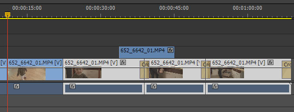
Here the selection is a bit more obvious. Watch what happens, when the shortcut is pressed now.

after-2

The transitions are applied at the end, and in between the clips. Remember to learn the new combination of keys – D, cmd/ctrl+D – if you want to use the playhead to apply the transitions.

To add confusion, there is a keyboard shortcut to “Apply Default Transition to Selection”, which works exactly like Apply Default Transition if clips are selected, although it applies both audio, and video transitions.

My little mind can’t comprehend the idea behind this change, especially since I’m not the only one who was taken aback upon the first encounter with the new behavior. But I know of others who are happy about it, and I found some use of it as well… only to encounter a stray transition during the final viewing of a recent production.

So remember – D , Cmd /Ctrl +D is your new shortcut for Apply Default Transition at the Playhead.

The Case For Three-Button Mouse Editing

RzrNaga2012_view3Mouse-driven editing has usually been associated with the lower end of video editing, and to a certain extent justifiably so. If I see a person using only his or her mouse to edit, I don’t consider them very seriously. Editing is a tough job, and a human being has two hands, so why not put both of them to work? Put that left hand on the keyboard right now!

The question of whether the right hand should spend more time there as well or not is debatable. Even though I have been driven through CS6 mixed bag of innovations to make more extensive use of my touch-typing skills during editing, I am still looking to improve on the mouse side of things, because the hybrid mouse + keyboard editing has been historically the fastest way to use Premiere.

When it comes to mouse mastery, nothing can beat 3D artists, especially modellers. The necessity to constantly change the point of view in three dimensions clearly showed that not only a single mouse button is not enough, but that even two will not suffice. You need a 3-button mouse to work in a 3D application. Period.

Granted, using the middle button with most mice is something that requires a bit of practice, since often it entails pushing on the scroll wheel. However, the newly acquired skill gives you more flexibility, and options. Why then not use a 3-button mouse in editing? And why not take advantage of the fact, that pushing the middle button is not as easy, as pushing the other ones?

One thing that I found myself using a lot during mouse-driven editing was delete and ripple delete. Even after remapping my keyboard, it still remained a two-click process. First select the clip, then hit delete. Fortunately you can use both hands, but still, there is some space for optimization here. The middle mouse button could be used to perform a single click ripple delete.

Another idea for middle mouse button is to map it to “Deselect all”, and it might become pretty handy with the incoming CS Next confusion about the primacy of selection over playhead, or targeted tracks for example during applying transitions.

Both of these options are available now via many macro recording and automation pieces of software. Personally I use the ones that came with my mice – either Microsoft’s IntelliMouse or Razer Synapse. They both allow remapping the middle mouse click for certain applications to a macro or a shortcut key (and much more, if you wish to explore them further). Therefore I first make sure to create the keyboard shortcuts to “Ripple Delete” or “Deselect All”, and then to map these shortcuts to the middle mouse button. And voila! Single click ripple delete or deselect all are literally at your fingertips now.

The quest for ever more efficient editing continues, and I hope to have some exciting information for you soon.

Democratization of Color Grading – what’s the next move?

Yesterday BlackMagic released an upgrade to its free version of the industry standard grading tool, daVinci Resolve. The biggest and most influential change was surely removing the limit of 2 nodes that was present in previous Lite version. This bold move essentially makes the professional color correction software available to everyone for free. I am still waiting for the announced Windows version, that would make it even more accessible, but it’s almost a given at the beginning of the next year.

There still are limitations – you can at most output at HD resolution, even though you can work with footage that is much bigger than that, you won’t get noise reduction, you are limited to a single GPU. That said, most of the people to whom this version of software is directed hardly ever yet think about projects in 2K and above and have not considered buying a second GPU except perhaps for gaming purposes. However you choose to look at it, BlackMagic did surprise everyone by providing amazing piece of truly professional software for free. This kind of democratization of grading tools is certainly terrific, and unexpected. It is however not yet disruptive enough. What will BlackMagic next move be?

I see this release as a preemptive strike against Adobe (see my previous post on Adobe acquiring Iridas) and following Apple recent “prosumerisation” trend. In Adobe CS6 we will almost certainly see integrated SpeedGrade color-correction software – to many it means that they will get this tool almost for free (for the price of upgrade, but you would most-likely want to upgrade anyway). To attempt to win the new users, there was little else that BlackMagic could do. However the question still remains, why would BlackMagic voluntarily resign from some part of their income? Why not sell the newly unlocked Lite version for $99 or $199 and profit handsomely? What’s in it for them, apart from perhaps profiting from monitoring interfaces that they already sell? Let’s speculate a little bit.

One of the things that distinguishes “real” from “would-be” colorists is a control surface. It’s a tool dedicated towards increasing speed and ease with which to operate the software. All companies that provide serious grading software also sell special panels that go with it. This hardware is extremely expensive, costing anywhere from ten thousand to several hundred thousand dollars. BlackMagic does have its own model, which costs about $20 grand. Of course, in the world of high-turnover, high-end productions, such costs are quite quickly recovered. But this highly demanding pro world is relatively small, and competing companies rather numerous: BlackMagic, Digital Vision (former Nucoda), Baselight, Autodesk, Quantel, to name a few important ones.

Certainly no home-grown editor would-be colorist will shell out $20k for a tool that will sit idle 90% of their working time. Towards this end companies like Euphonix (now Avid), and Tangent Devices developed less sophisticated models that cost about $1500. For a pro it is often a very reasonable price for an entry-level piece of hardware that will pay for itself pretty quick. However, for a prosumer it is still at least two to three times too much, especially considering very limited use of the said tool. Regular consumers are willing to pay $499 for a new iPhone, avid gamers usually spend this much on a new GPU, and I guess this is about the limit that a prosumer color-grading surface would have to cost to catch on big time.

From a business perspective, selling 10 000 pieces of hardware costing $500 each earns you more than selling 10 $20k ones. Apple knew that when they released Final Cut Pro X (regardless of what you think about the program). Professional market is quite saturated, and there is not much to be gained there. It is also very demanding. Prosumers are much easier to appease, and their tools do not have to withstand the amount of abuse that pros require. Following the Apple model – giving the tool to prosumers – is a surer promise of profit, than appealing to the demanding pros.

The question is – who will make this move? Two years ago I would say that Apple might be one of the best candidates, but after introducing weird color control in Final Cut Pro X, and focusing all their efforts on touch panels I’m pretty sure they are not the ones. I don’t expect Tangent Devices or Avid to undercut the sales of their relatively low-cost models, especially after Tangent recently revamped their panels. BlackMagic is the most likely candidate, because right now they only have their high-end model. Creating a new version takes a lot of R&D resources, both time and money, and it is pretty hard to compete in this segment. BlackMagic also always did appeal to those with lower budgets, and this kind of disruptive move is something that is the easiest to expect from this company.

Therefore I am waiting for a simple control surface that will cost about $500-$700, will be sturdy enough to last me two years of relatively light to moderate use, and sensitive enough for the kind of color grading that I presently do – nowhere near truly professional level, but sometimes quite demanding nevertheless. I understand the big problem is producing decent color wheels, but I don’t loose hope that somebody will come up with some neat idea, and implement it. And no, multitouch panel will not do. If you wonder why, read another of my articles on the importance of tactile input. The whole point of control surface is that you don’t have to look at it while grading.

Finally, is the realm of professional colorists in any danger from the newcomers? To a certain extent perhaps. The field will certainly become more competitive, and even more dynamic, perhaps a few players will drop out of the market. On the other hand, more people will be educated about the quality of good picture, and more will require this quality, and also will be able to appreciate excellent work that most of the professionals do. All in all it probably will influence more the job of an editor than a colorist, bringing the two even closer together – the editors will be required to learn color correction to stay in business. In the high-end productions not very much will change, the dedicated professionals will still be sought for both for training and for expertise. Perhaps some of the rates will go down, but most likely in the middle range. In the end I think it will have net positive effect on what we do and love.

Will we then see a new product during NAB 2012 or IBC 2012? I would certainly be the first in line with my credit card. And if we do – you heard it here first. 🙂

Tactile input is important

Recent (?) fascination with touch-controlled interfaces is perhaps good for their development, but in my opinion they are not necessarily the future of device manipulation.

One of the big mixed blessings is that you have to rely on the visual feedback to operate such an interface. While it is perhaps a tad faster to manipulate directly items that you’d always want to look at—like photos—or that wide-sweeping gestures are faster than looking for “next” or “previous” buttons, it is not necessarily so with interfaces that rely on mixed tactile/visual, and sometimes even auditory feedback.

An excellent example is a keyboard. A keyboard gives you at least three kinds of input: tactile (feeling of pressing the key and its shape), auditory (click of pressing the key), and finally visual – letters appear (or not 🙂 ) on the screen. Many people do not appreciate the first two, mostly because they were not trained in typing without looking at the keyboard to find each letter that they type, or to use all their fingers while typing. Personally I believe that classes of quick typing should be obligatory in primary or high schools and would be more useful in daily life. For example, when visiting a doctor, I often find that he takes more time to use his computer to type the diagnosis with two fingers than to actually examine his patient. What a terrible waste of time.

Anyway, the reason that mixed input is important is about efficiency. Once you learn to stop looking at the keyboard while you type, you reach a new level of efficiency. You start relying on your tactile and auditory input to feel and hear if you have pressed your key, and to an extent to know which key you pressed, only using visual feedback for confirmation, not estimation. For those who wonder why there are small embossed dashes on the F and J keys – they are places where your index fingers will be when you use proper typing technique.

Touch screen does not give you this advantage. You use visual cues to find the proper key, robbing yourself of the input by covering the key you want to press at the same time, and then for verification. You use a single channel to process the information. It is slower not only because tactile information reaches your brain and is processed 10 times faster, but also because you use serial processing instead of parallel one. While typing on a classical keyboard I know I have pressed a wrong or a good key even before I get the confirmation on the screen. Therefore it is much easier for me to switch from typing to correcting mode (and yes, there is a noticeable switch going on), than I would when I am typing on a touch-screen keyboard. My impression also is that the responsiveness and robustness of touch screen interfaces is still not at the level of keyboards, but I might be wrong, since this field evolves very quickly.

Another example where tactile input is vital, are the devices which one would be able to operate without having to look at them. One that comes to my mind is an mp3 player. Usually this device sits in my pocket or in a place that I do not have an easy visual access to, and for a good reason. Therefore if I want to increase the volume, lock the controls or change/rewind the track, I would prefer not to need to put the device in the center of my visual attention. Running, cycling, driving — these are the activities that do not lend themselves well to visual distractions. Admittedly, using any device while driving will lessen one’s concentration and might result in an accident, but this is precisely why most of the car interiors are built in such a way that you can rely on tactile input to turn on radio, heating, conditioner and all else.

Therefore, it makes little sense to design an mp3 player with touch screen input. When the buttons are present, you can learn their layout, and operate the device without the need to look at it. You will get immediate auditory input — increase in volume, next track will start playing etc. And you can easily lock/unlock controls, which perhaps is the biggest advantage of all.

There is also another issue. While using touch-screen to manipulate photos you often cover the part that you’re interested in manipulating, therefore robbing yourself of a visual feedback that the touch-screen is supposed to give you. This is not necessarily an optimal way to work. I would agree that it is the way that we manually paint or write, but it only shows the limitation of our tools (limbs). Personally, when faced with a choice of a touch-screen tablet, and a standard screen with a cursor, and a traditional tablet, I prefer the latter, simply because my field of view is wider. Motion estimation is similar in both cases, even if the second way takes more time to learn, and to get used to, like learning to use any tool or device.

All these examples show that if touch-screen interfaces want to become more useful, they will have to evolve additional feedback mechanisms. As of now, there are too many applications where they are detrimental to efficiency, and when we consider them setting their “coolness” factor aside, their application is still limited in scope.